Randolph-Macon’s brand identity is a suite of approved symbols that, when consistently applied, help us achieve a recognizable brand. Understated and timeless, RMC’s symbols are essential to brand communications—and care has been given to customize their appearance.
The symbols described should be used only in compliance with the rules outlined and for non-commercial purposes. These files should never be altered.
Questions about identity usage may be directed to the Office of Marketing and Communications: brand@rmc.edu.
Logo Usage Guidelines
Main Logo: Wordmark
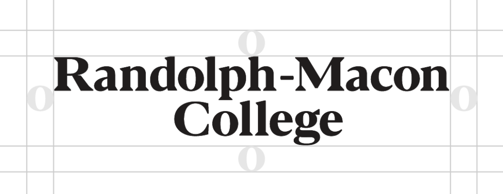
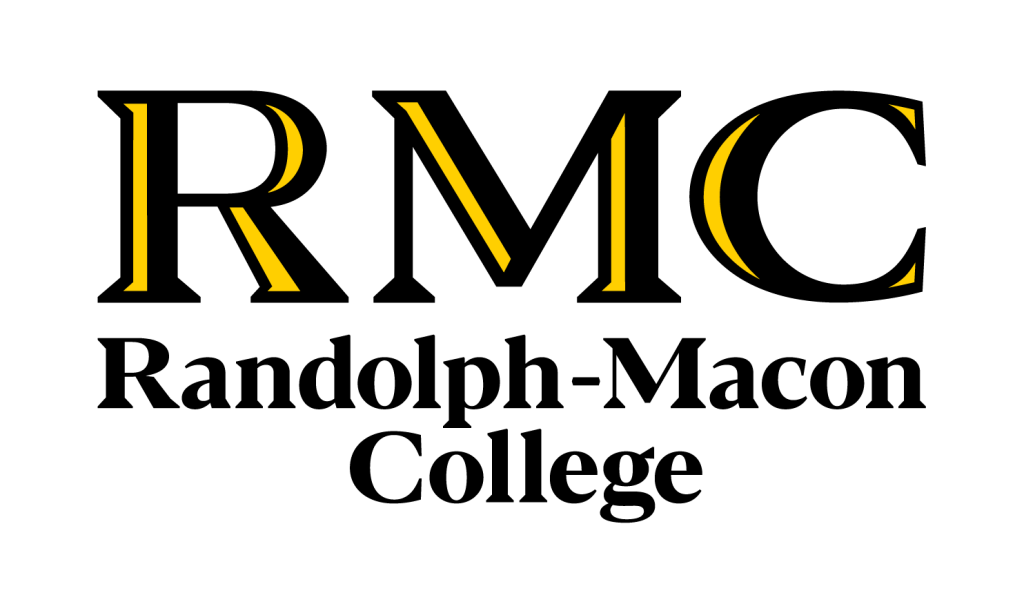
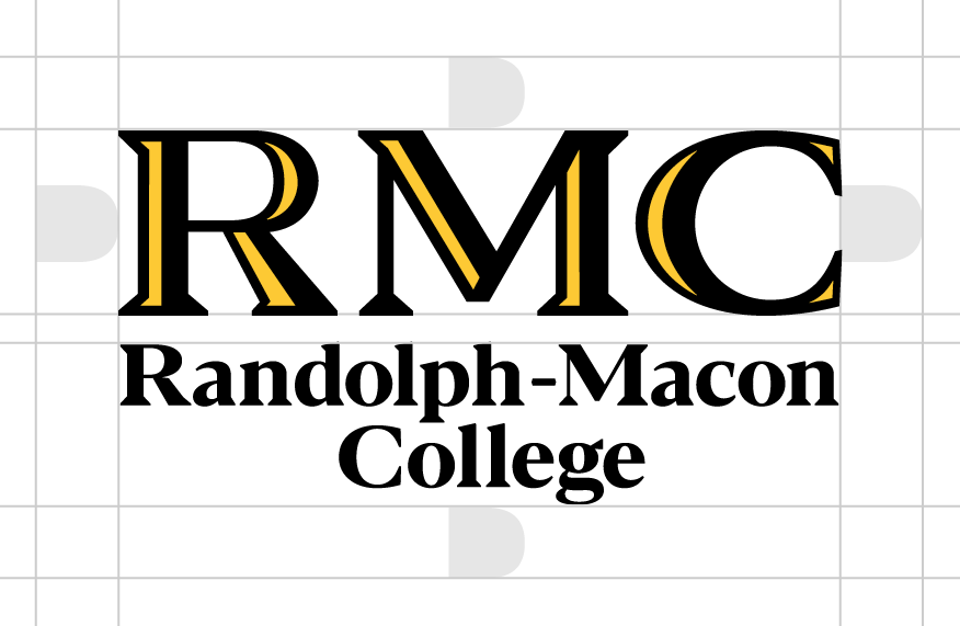
The College’s primary identifier is a wordmark designed with a custom typeface. The letterforms of the wordmark are customized, so do not attempt to re-typeset the wordmark.
Horizontal Wordmark
Stacked Wordmark
The horizontal wordmark is the preferred version, however there is a secondary stacked, two-line version for use when surrounding space is at a premium.
Always be sure to use adequate clear space around the logo equivalent to the height and width of the “o.”
Color Combinations
The black wordmark should be used over white, yellow, or light gray. The yellow wordmark should be used over dark gray or black. The logo should not be placed over any other colors.
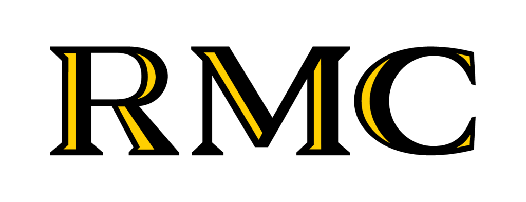
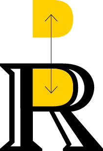
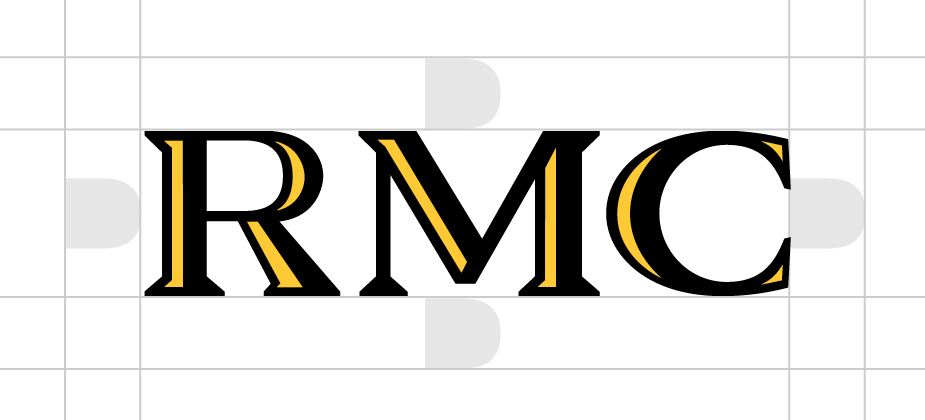
Monogram
When communicating with audiences familiar with the College, the RMC monogram provides a helpful visual shorthand.
The monogram is composed of a custom letterforms and cannot be re-typeset.
Always be sure to use adequate clear space around the logo at the size of the bowl in “R.”
Color Combinations
The monogram may be used in the shown color combinations and may not be placed over any other colors.
Lockup
The wordmark-monogram combination—or “lockup”— can be used when there is need to introduce the College name while adding visual interest, particularly in external communications to audiences unfamiliar with RMC.
Always be sure to use adequate clear space around the logo at the size of the bowl in “R.”
Color Combinations
The logo lockup may be used in the shown color combinations and may not be placed over any other colors.
Branding over Photographs
Logos may be placed over photographs only when sufficient contrast can be achieved. In limited situations, if the Lemon version of a mark does not provide enough contrast, the one-color white version may be used.
One-Color Logos
When brand marks are reproduced in one-color applications, such as one-color printing or screen printing for swag, the one-color version may be used. Black and lemon versions of the wordmark and monogram are primary and should always be used by default. The one-color versions should only be used in unusual circumstances.
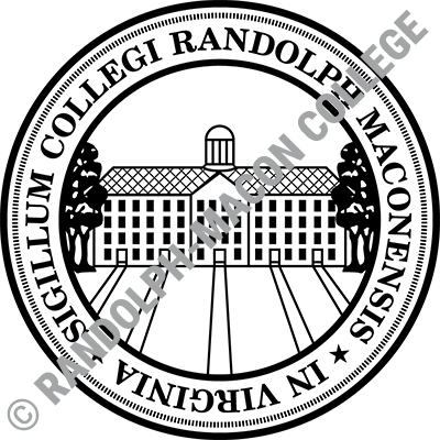
College Seal
Usage of the College seal is reserved for official college documents and communications from the president and provost’s offices—such as commencement programs, diplomas, dedications, and awards.
The Office of Marketing and Communications maintains digital files of the college seal and should be consulted on all of its applications.
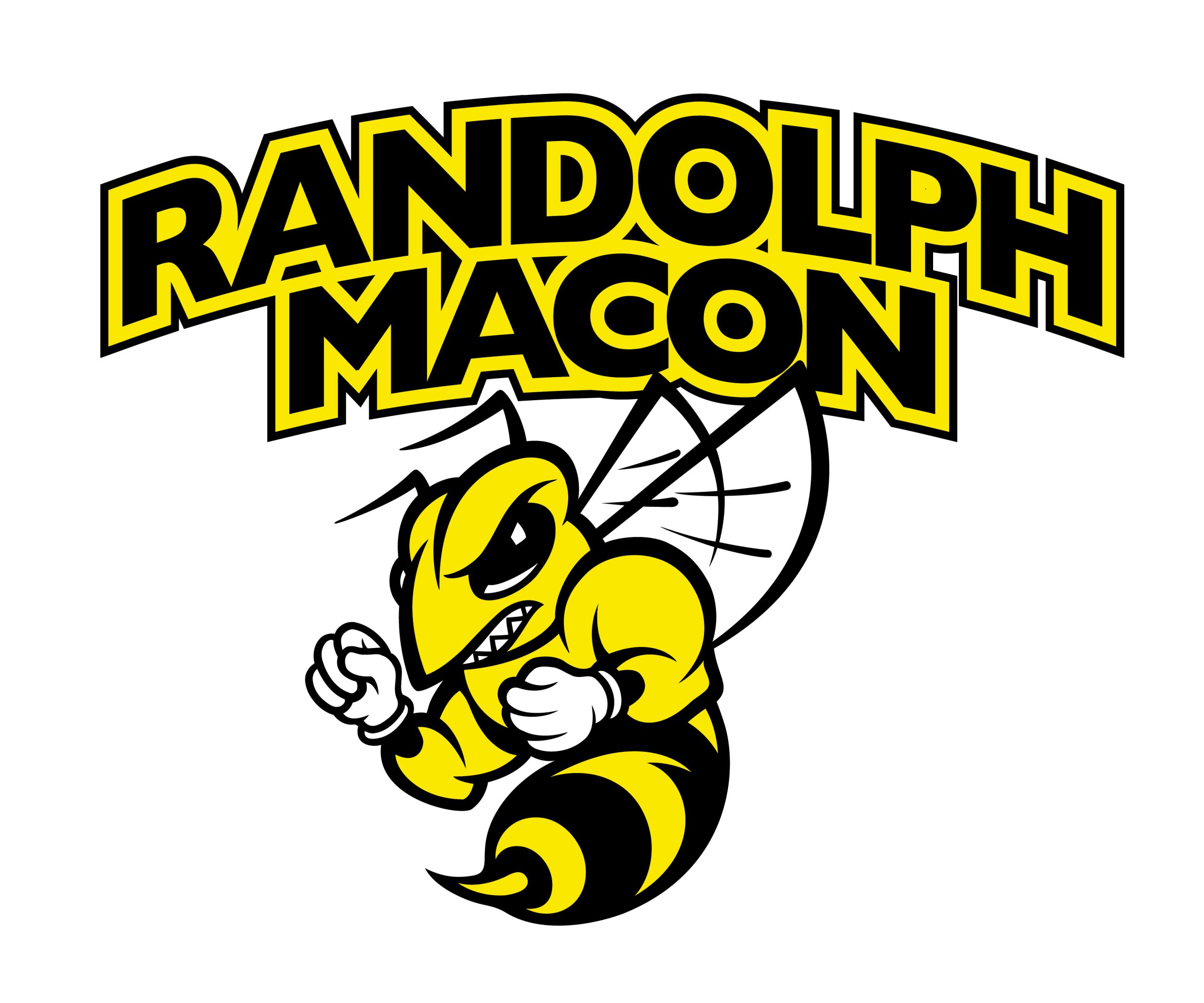
Athletics Logo
The athletics logo, or “Buzz,” is the symbol representing varsity athletics activities and should not be used for the College’s academic areas and/or non-athletics communications. Buzz should not be used interchangeably with the College wordmark or monogram, which is the primary logo to represent the institution.
Color Combinations
To ensure consistency, be sure to use the approved reverse version of the athletics mark over dark backgrounds. Do not manually add a white outline to the logo file; use only approved logo files.
Alternative versions of the athletics logo include an RMC-abbreviated version, a free-standing Buzz, and versions for each of RMC’s NCAA sports. To request those logos, please contact brand@rmc.edu with detailed information on their intended usage.
Incorrect Logo Usage
It is important to use the College’s identifiers with consistency, avoiding variations. Logo files should never be altered. This is not an exhaustive list and only shows a small sample of potential violations.
Do not attempt to reconfigure or re-type the wordmark. Use only approved logo files.
Do not re-color any logo and logo element.
Do not add an outline, or “stroke,” to any logo.
Do not use a logo over any color other than white, black, gray or yellow.
Do not use the “Lemon” version of a logo on a background other than black or gray.
Do not combine a logo with any other text.
Do not combine a logo with any other symbol.
Do not combine athletics marks with college marks or other text.
Do not place a logo inside a container shape.
Do not place the logo over an image—or an area of an image—where its readability would be compromised.
File Downloads
Downloading these files assumes your understanding of the rules stated here, as well as the College’s ownership of its intellectual property. If you need a logo file in a different version or vector format or have a question about logo application, email brand@rmc.edu.
Black Pantone: PMS Black 6 CMYK: 40/40/40/100 RGB: 0/0/0 HEX: 000000
Secondary
The secondary palette provides a strong, rich grounding; is easily paired with the primaries; presents a range of options for contrasting and knocking out; and is assertive enough to take a lead role in variations from lemon-and-black-dominant applications.
The Roboto super family of typefaces is the brand’s workhorse, providing maximum flexibility with sans serif and slab options. The sans serif and condensed fonts work primarily for long text/paragraphs while the geometric slab version helps set a friendly, collegiate tone when used in headlines.
A modern, geometric sans-serif font that pairs well with Roboto Slab, Red Hat can be used an alternative to Robot Slab in headlines for a more streamlined, sophisticated feel.


